A poem by Kay Ryan:
However carved up
or pared down we get,
we keep on making
the best of it as though
it doesn't matter that
our acre's down to
a square foot. As
though our garden
could be one bean
and we'd rejoice if
it flourishes, as
though one bean
could nourish us.
Joy in the little things.
Inspiration from minute things.
..."our garden could be one bean and we'd rejoice if it flourishes..."
Perhaps I start off with huge dreams and as life presses on, those dreams become more and more elusive, more unattainable, less important, shoved aside by the daily grind. But as those dreams get smaller and smaller, I still hold onto them and find hope in them, "as though one [dream] could nourish [me]."
Wednesday, May 12, 2010


Friday, April 30, 2010
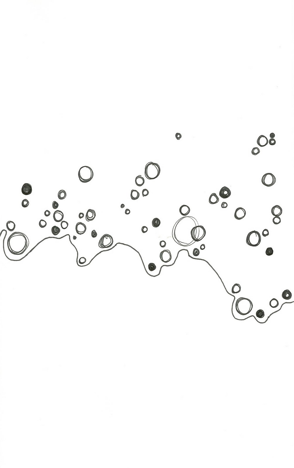
Possible summer project
 This is a doodle from my sketchbook. I was thinking I could do maybe 22 x 30, paint them with acrylic paint, perhaps choose a color scheme that will lend to optical mixing, like Seurat. I might leave black outlines visible or maybe no outlines at all. As for the background, I might start off by leaving the white background of the paper. If I do a series, of course I would try different things: colored background, different color schemes, perhaps imbed an image within the circles.
Leonardo Drew
The Weatherspoon Art Museum is currently exhibiting the work of Leonardo Drew. Walking through the gallery, I made a list of adjectives that came to mind as I viewed his work:
industrial
rust
found objects
repetition
textile
earth tones/natural tones
geometric
layering
molds
mundane objects
number
texture
drape
aged
industrial
rust
found objects
repetition
textile
earth tones/natural tones
geometric
layering
molds
mundane objects
number
texture
drape
aged
Of the works presented in the Weatherspoon, Number 59 (1997), was my favorite. I couldn't find an image of it so I'll do my best to describe it. From far away, or from across the gallery, 59 looks like a huge black square. However, when you get up to it you realize it's a series of vertically rectangular little black wooden frames. The frames are held together by black screws, some with 2, some with 3, some with 4 screws. Inside each frame is glass, most being fractured. Black paint covers most of the glass as well, though a very soft cream color pokes through here and there, revealing the spider web of broken glass. There is a section in the bottom third of the piece, 3 frames high and 28 frames wide, that are all black, no cream showing or broken glass poking through. It was not noticable right away to me, though the realization came later after I had studied the piece for awhile.
Obsessed with number and pattern, I counted the number of frames: 20 frames tall and 28 frames wide. Typically I am not attracted to darkly colored pieces. I think my fascination with number, pattern, and repetition is the reason I was initially drawn to 59. I can't imagine it being any color but black. It definitely wouldn't have the same imposing effect. It's almost overwhelming to look at, with all the different frames, all the different breaks in the glass. It's like each little frame is an individual composition in itself. The black paint is what ties it all together though; the black paint is the unifying factor.
Saturday, April 24, 2010
Space, Place, Pointed Invention: Final Project
The criteria: Your final project will be an investigation into how an intense experience of a space or place can bolster and spur on a visual imagination. You will make a mid-sized collage (minimum size is 22"x30") based on source drawings, notes AND memory of a place you have easy access to on a daily basis. You may not work from photographs of a place directly. To clarify--you can generate source drawings from photographs, but minimally. I want you to have to work with the potentially inventive results which happen when you are forced to recall or work with images that are not visually exacting in re-presentation. The material is up to you. You must somehow employ these concepts into the work: repetition, monochromatic, texture (reproduced or actual). All the visual source imagery you use must originate with your site.
The space I have chosen is under the kitchen table. When I was a kid, my brother and I would throw blankets and quilts over the kitchen table to construct a fort. My intent for this project is to create an image of that, but take it a step further by creating the imaginary, jungle world that the table fort became when I climbed under it.
It took me a while to get started on the actual piece; I made drawings of the table, took pictures, and built a fort with blankets and quilts. I also sketched a lot of plant life to aid in creating my jungle world. Now that I've started, things are moving along pretty well. I got stuck after about a day. Fortunately, we had an in-class critique and I got some excellent feedback from my peers. Here is what it looked like before:


The space I have chosen is under the kitchen table. When I was a kid, my brother and I would throw blankets and quilts over the kitchen table to construct a fort. My intent for this project is to create an image of that, but take it a step further by creating the imaginary, jungle world that the table fort became when I climbed under it.
It took me a while to get started on the actual piece; I made drawings of the table, took pictures, and built a fort with blankets and quilts. I also sketched a lot of plant life to aid in creating my jungle world. Now that I've started, things are moving along pretty well. I got stuck after about a day. Fortunately, we had an in-class critique and I got some excellent feedback from my peers. Here is what it looked like before:

The suggestions: establish a ground plane; correct the perspective; need a signifier that it's a table, perhaps with a table setting on top, or details in the legs. After taking these things into consideration, I began working on it again, and this is what it looks like now:

After changing the perspective, it looks more like a table. I've still got some editing to do on the table, but at least it looks more like a table now. I still need to establish a ground and then start building up the flora. And I've got to do it in 2 weeks.
Monday, April 19, 2010
Henry Darger
In crafts class we watched a documentary about an outsider artist, Henry Darger, who created a fictional, 15,000-page masterpiece titled The Story of the Vivian Girls, in What Is Known as the Realms of the Unreal, of the Glandeco-Angelinnian War Storm, Caused by the Child Slave Rebellion, or In the Realms of the Unreal, for short. Darger created watercolors and collages with found images and materials to illustrate his epic tale of the Vivian sisters. I had never heard of the term "outsider artist" before. An outsider artist is one who is self-taught, with no formal or academic training. I had also never heard of Henry Darger. His art was not discovered until his death, when his landlords cleaned out his apartment.
Darger's art is so colorful and vivid! They are such imaginitive landscapes! Besides the coloring, I am drawn to the busy-ness and particular format (panoramic) of the scenes. To be frank, some of the subject matter is quite disturbing and weird. Aside from that, Darger's art is infinitely fascinating.
The American Folk Art Museum in New York currently has the largest collection of Henry Darger's work, and from what I've found, they have the best online image source.
Darger's art is so colorful and vivid! They are such imaginitive landscapes! Besides the coloring, I am drawn to the busy-ness and particular format (panoramic) of the scenes. To be frank, some of the subject matter is quite disturbing and weird. Aside from that, Darger's art is infinitely fascinating.
The American Folk Art Museum in New York currently has the largest collection of Henry Darger's work, and from what I've found, they have the best online image source.
Thursday, April 15, 2010
Edgar Degas
The last couple of classes in art history (19th century European) we've been talking about the Impressionists. Today we talked about Degas. I've always admired his work. I've got a book of his drawings of dancers. my professor, Richard Gantt, has pointed out just how sophisticated and brilliant Degas' compositions are, how they are dynamically balanced/symmetrical. I had never payed that much attention to his layouts; I've always been so distracted by his perfect drawings and coloring. Now that I see it, I am even more fascinated. In a lot of his paintings, he clusters a bunch of figures in one corner and the rest of the painting is sparse, but it works! He's got just enough elements and just the right colors and lighting to make it work. Brilliant! Here's a couple of my favorite Degas paintings. A great website for Degas images is http://www.edgar-degas.org/
Dancers Practicing at the Barre
Dancers in Pink
Ballet Rehearsal, 1873


Dancers Practicing at the Barre
Dancers in Pink
Ballet Rehearsal, 1873


Tuesday, April 13, 2010
Just an idea...
These pages from my sketchbook were inspired by Eva Hesse. They are extremely preliminary drawings. To be quite honest, they are scribble-scrabble with a few spaces colored in. The line I'm beginning to think along is perhaps seeing what shapes or figures I might could find in this big, jumbled mess of lines. I was also thinking of creating some on transparencies, using different color schemes, and overlaying them to create different compositions.


Thursday, April 8, 2010
Self-Portrait Final Critique
I finally finished up my collage self-portrait. Well, let me re-phrase that. I finished it for the critique, and now after the critique, there are a few things I need to go back and tweak. Most of my time was spent on the face. The work was tedious, to say the least; I chose to rip up all those little pieces instead of cut them. I have never done a self-portrait so it was definitely a learning experience. I explored my face in the mirror and tried to feel my way over all the angles and curves. It turns out that the self-portrait doesn't really look anything like me, but that is quite alright; I think it turned out being more about the process anyway. I thoroughly enjoyed the process. I was looser than I have ever been before working on a project. I was messy and not at all precise. I am really pleased with the way the face turned out. I was concerned in the beginning because it wasn't shaping up like I expected it to. That is until I started adding darker values. Once I finally began that, the whole piece started coming together. I had to go back and forth between the hair and the face, and then the shoulders and the hair to get a believable and nice balance of values and visual weight. During the in-progress critique, it was suggested that I might add a really subtle gray-blue in the eyes to break up the monotony of the neutrals. I did and completely agreed with the suggestion. It's just blue enough to be different, but not so blue that the eyes become the focal point. I am still unsure of the neck and shoulders. I tried to taper the tiny strips over some thicker, darker strips to unify the face and neck. Most of my peers like it so I may leave it.
Overall I got positive feedback: it looks like I put a lot of time into it; the value adds dimension to the face; the scale shift in the strips on the face, hair, and neck are a nice contrast. The suggestions: perhaps intermingle the various strip sizes so it looks less quadrant-like; really push the hair by adding more curls; re-evaluate the eyes, situate them more so they look less stylized, and perhaps use the same tiny strips of paper from the face to shape the eyes. I also got the comment from a peer that the portrait made her skin crawl. I thought that was hilarious, considering that the face is made up of thin strips, resembling some sort of slinky bug.
Once I get the piece back, I will address the suggestions that I was given and see if I can finish it up once and for all.


Overall I got positive feedback: it looks like I put a lot of time into it; the value adds dimension to the face; the scale shift in the strips on the face, hair, and neck are a nice contrast. The suggestions: perhaps intermingle the various strip sizes so it looks less quadrant-like; really push the hair by adding more curls; re-evaluate the eyes, situate them more so they look less stylized, and perhaps use the same tiny strips of paper from the face to shape the eyes. I also got the comment from a peer that the portrait made her skin crawl. I thought that was hilarious, considering that the face is made up of thin strips, resembling some sort of slinky bug.
Once I get the piece back, I will address the suggestions that I was given and see if I can finish it up once and for all.


Andy Goldsworthy - Rivers and Tides
Today in Variable Topics in Drawing we started watching Rivers and Tides (2001), a video following Andy Goldsworthy, a site-specific sculptor and land artist. I've already seen the video twice, but it hasn't gotten old yet.
In the video, Andy's musings are so personal! He seems so in touch with himself and with nature. One of the things he said that really touched me was that "taut control can be the death of a work." For the majority of the time, I am precise, organized, and extremely controlled in my artwork. I almost constantly have on hand scissors, tape, a ruler, and a Sharpee pen, my choice tools for an exacting work method. I have found, especially this last year in college, that this particular work method of mine has killed stone dead many of my art ventures. Sometimes it works to have a plan and to carry it out. However, I'm beginning to learn that my creativity is at its best when I don't impose upon myself such strict rules and ideas that I unconsciously stifle my creativity and imagination. Art is often about the process and the evolution of the piece and not always about the final product. In constructing one of his cairns of stone that took quite a few tries to complete, Andy talked about how each time he had to start reconstructing the cairn, his understanding of the stone grew a little bit more, and that each new attempt he got further than he had before, until finally he completed the cairn. In the same way, if I allow myself to explore the process of creating a piece of art, getting to know my materials and deepening my own understanding of the concept, my success in creating the piece will be more than I could have imagined in the first place.
In the video, Andy's musings are so personal! He seems so in touch with himself and with nature. One of the things he said that really touched me was that "taut control can be the death of a work." For the majority of the time, I am precise, organized, and extremely controlled in my artwork. I almost constantly have on hand scissors, tape, a ruler, and a Sharpee pen, my choice tools for an exacting work method. I have found, especially this last year in college, that this particular work method of mine has killed stone dead many of my art ventures. Sometimes it works to have a plan and to carry it out. However, I'm beginning to learn that my creativity is at its best when I don't impose upon myself such strict rules and ideas that I unconsciously stifle my creativity and imagination. Art is often about the process and the evolution of the piece and not always about the final product. In constructing one of his cairns of stone that took quite a few tries to complete, Andy talked about how each time he had to start reconstructing the cairn, his understanding of the stone grew a little bit more, and that each new attempt he got further than he had before, until finally he completed the cairn. In the same way, if I allow myself to explore the process of creating a piece of art, getting to know my materials and deepening my own understanding of the concept, my success in creating the piece will be more than I could have imagined in the first place.
Friday, April 2, 2010
A perfect spring day
Here are some photos I took this morning. With clear blue skies, the sun rising, and dew still on the ground, it was a perfect opportunity that I just couldn't pass up.


Self-Portrait in words
The task: In a series of 25 images - written out with as much or little description as you like - create a self-portrait of yourself.
1. Christ as my core - He determines everything that I am and everything that I do.
2. Silence
3. Gentle and quiet spirit
4. Curly hair, courtesy of Dad; blue eyes, courtesy of Mom
5. Somewhat resilient
6. A perfect spring day
7. Lots and lots of sunshine
8. Outside, outside, outside
9. Encouraging others/others encouraging me
10. Hugs, HUGS, hugs
11. Diet Sundrop = "life juice"
12. Fitness - energy, health, releasing of negative emotions
13. I love you, I love you, I love you, I love you, I love you, I love you...just say it
14. Home-making - cleaning, cooking, decorating, organizing
15. Stiff tear ducts - cold-hearted? I hope not. Resilient? Not in check with my emotions?
16. Peter Pan
17. Look, look, look - at pictures, books, magazines, nature, architecture - INSPIRATION
18. "There was an old owl who sat in an oak. The more he heard, the less he spoke. The less he spoke, the more he heard..."
19. COLOR
20. Reserved, uptight?, modest, restraint
21. Love, love, love, love stories - Anne of Green Gables, Pride & Prejudice, Emma
22. Language - word origination, new words, beautiful words, beautiful descriptions
23. Gardening - dirt, water, plants, smells
24. Running
25. FAMILY
1. Christ as my core - He determines everything that I am and everything that I do.
2. Silence
3. Gentle and quiet spirit
4. Curly hair, courtesy of Dad; blue eyes, courtesy of Mom
5. Somewhat resilient
6. A perfect spring day
7. Lots and lots of sunshine
8. Outside, outside, outside
9. Encouraging others/others encouraging me
10. Hugs, HUGS, hugs
11. Diet Sundrop = "life juice"
12. Fitness - energy, health, releasing of negative emotions
13. I love you, I love you, I love you, I love you, I love you, I love you...just say it
14. Home-making - cleaning, cooking, decorating, organizing
15. Stiff tear ducts - cold-hearted? I hope not. Resilient? Not in check with my emotions?
16. Peter Pan
17. Look, look, look - at pictures, books, magazines, nature, architecture - INSPIRATION
18. "There was an old owl who sat in an oak. The more he heard, the less he spoke. The less he spoke, the more he heard..."
19. COLOR
20. Reserved, uptight?, modest, restraint
21. Love, love, love, love stories - Anne of Green Gables, Pride & Prejudice, Emma
22. Language - word origination, new words, beautiful words, beautiful descriptions
23. Gardening - dirt, water, plants, smells
24. Running
25. FAMILY
Saturday, March 27, 2010
Gridded
 This is a little experiment I did in my sketchbook the other day. I drew a grid, then took two colorful magazine pictures and cut them up using the same grid pattern. Then I glued the pieces down, alternating the pieces from the two pictures. This is how it turned out. The colors are vibrant, the pattern is interesting. I must admit that when i try to separate the two pictures with my eyes, I get confused. I think I'd like to try some more, perhaps some different patterns and different color schemes. I also might print some of my own pictures and cut those up. It would definitely make it more personal.
Thursday, March 25, 2010
3/22/2010 - Third day of spring
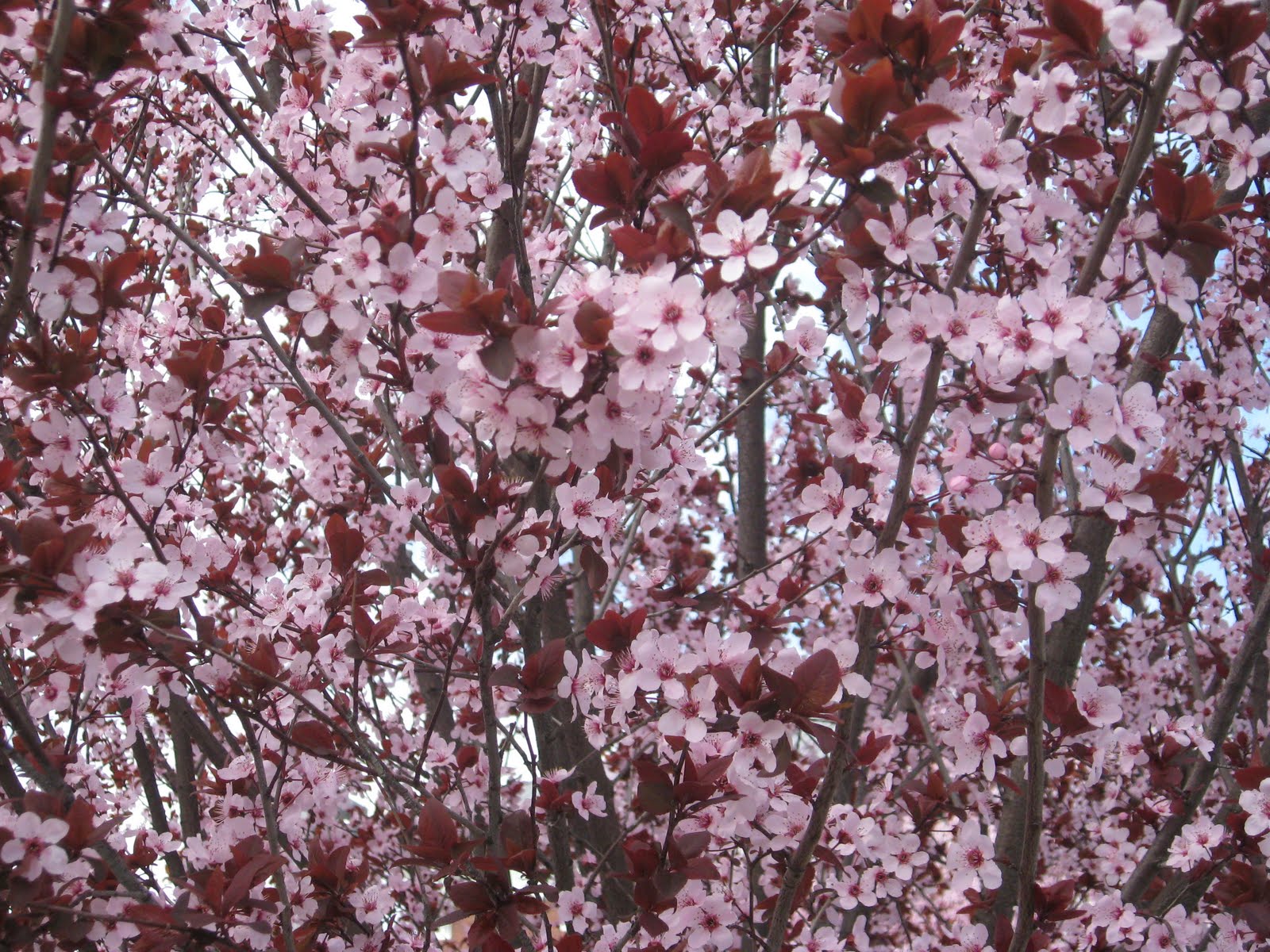
The trees in the UNCG parking lot are blooming and are absolutely gorgeous! It seems that they sprung to life just over the weekend. The bigger ones are white and from a distance, look like they are covered with fluffy cotton balls. The smaller trees are blooming pink, with deep red interspersed here and there where some leaves have sprouted.
They're all so full of life and hope and promise! It's invigorating, inspiring! It makes me want to plant something or start something new.
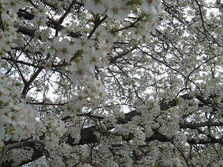


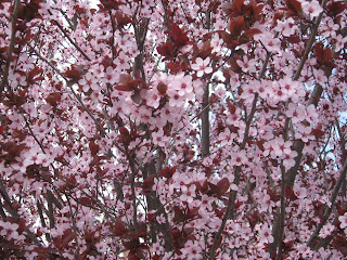
They're all so full of life and hope and promise! It's invigorating, inspiring! It makes me want to plant something or start something new.


Friday, March 19, 2010
In-Progress Self-Portrait
The class: Variable Topics in Drawing/Collage
The professor: Barbara Campbell-Thomas
The project: make a self-portrait exhaustively investigating the potential of line, mark, and value. Employ collage heavily as you "construct" your portrait - constructing being a means of conveying an idiosyncratic version of yourself, not merely an adept visual equivalent. Ponder how collage's propensity toward fragmentation and juxtaposition might be useful to you in creating a self-portrait.
The photo of my in-progress self-portrait:
 The analysis: I enjoy the tactility of the portrait, the feeling of glued paper - stiff, wrinkly, crinkly. The ripped edges of the paper lend to its messiness, as does the visible brustrokes produced by the glue mixed with charcoal. I also love the size (it's obviously not to scale in the photo; it's size is roughly 4' x 5'). My tendency is to work very small and tediously. I feel with the size of this piece and the nature of its creation I have been able to loosen up a bit. It's nice to do something out of my comfort zone. With that, as always, comes trouble too.
I have a little trouble with scale at this size. Plus, I've never done a self-portrait so placement of my facial features is not coming easily to me. However, thanks to the nature of the project, I can literally cover my mistakes and rework what I don't like. I don't like my nose or mouth. I really need to rework that area. I use the terms nose and mouth generally because I don't actually have a defined nose and mouth.
Last class I began adding "curly hair." At the moment, I'm a little unsure about it. I may add a little more and gradually cover it up until some is poking through here and there so that it's not such an obvious feature.
Definitely still a work in progress.
The professor: Barbara Campbell-Thomas
The project: make a self-portrait exhaustively investigating the potential of line, mark, and value. Employ collage heavily as you "construct" your portrait - constructing being a means of conveying an idiosyncratic version of yourself, not merely an adept visual equivalent. Ponder how collage's propensity toward fragmentation and juxtaposition might be useful to you in creating a self-portrait.
The photo of my in-progress self-portrait:
I have a little trouble with scale at this size. Plus, I've never done a self-portrait so placement of my facial features is not coming easily to me. However, thanks to the nature of the project, I can literally cover my mistakes and rework what I don't like. I don't like my nose or mouth. I really need to rework that area. I use the terms nose and mouth generally because I don't actually have a defined nose and mouth.
Last class I began adding "curly hair." At the moment, I'm a little unsure about it. I may add a little more and gradually cover it up until some is poking through here and there so that it's not such an obvious feature.
Definitely still a work in progress.
Thursday, March 18, 2010
The Extra Ingredient
Yesterday I had about 3 hours to kill between school and work. Mom had told me about this cute little shop in the Friendly Center called The Extra Ingredient, the jackpot, so to speak, for stocking your kitchen. They have absolutely anything and everything you could possibly need for a well-stocked kitchen. They have oodles of cooking utensils, cast iron cookware, baking dishes, magnificent coffee makers, aprons, professional cutlery, specialty food items, tablescapes, cute little knick-knacks that you would buy just for their cuteness, and so much more!
Even though I didn't buy anything, it was such an inspiring place to browse! I left feeling an overwhelming need to create something...anything! But alas, due to work, the only thing I got to create was a royal mess while attempting to organize books in the New Age section at Barnes & Noble.
Here's a link to The Extra Ingredient so you can browse the online catalog to your heart's content: http://www.extraingredient.com/
Even though I didn't buy anything, it was such an inspiring place to browse! I left feeling an overwhelming need to create something...anything! But alas, due to work, the only thing I got to create was a royal mess while attempting to organize books in the New Age section at Barnes & Noble.
Here's a link to The Extra Ingredient so you can browse the online catalog to your heart's content: http://www.extraingredient.com/
Sunday, March 7, 2010

A collage from my sketchbook.
I was flipping through a magazine and came upon a beautiful photograph of ancient ruins in the desert. I was completely captivated by the colors. I ripped up the picture and created a base. For some reason, as I was contemplating this base of beiges and dark browns, this half-moon shape was stuck in my mind. I thought bright reds would beautifully complement the muted colors of the desert palette. It turned out rather nicely, I think.
Supplies
I love new supplies! Art supplies, school supplies, cleaning supplies, any kind of supplies.
Whenever I have new supplies I feel like I have a fresh, new beginning. I'm starting from scratch with no mistakes yet. It's such a refreshing feeling!
Here's part of my list of all sorts of new supplies that I love.
 pens, pencils, sticky notesfloor cleaner, stamps, glue
file folders, rubber bands, dryer sheets
acrylic paints, paint brushes, markers
Sharpies, white-out, scissors
push pins, windex, stickers
bristol board, dish detergent, double-sided tape
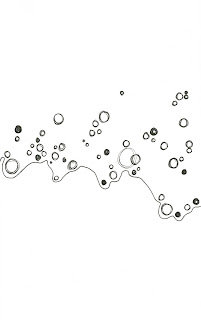
Here's a little design composition I did with my new Sharpies pen. It brought such joy to my heart!
Whenever I have new supplies I feel like I have a fresh, new beginning. I'm starting from scratch with no mistakes yet. It's such a refreshing feeling!
Here's part of my list of all sorts of new supplies that I love.
 pens, pencils, sticky notes
file folders, rubber bands, dryer sheets
acrylic paints, paint brushes, markers
Sharpies, white-out, scissors
push pins, windex, stickers
bristol board, dish detergent, double-sided tape
Of course, these are just a few supplies from my long, long list. My absolute favorite new supplies to get are pens, double-sided tape, and floor cleaner.
Here's a little design composition I did with my new Sharpies pen. It brought such joy to my heart!
Wednesday, March 3, 2010
Anne of Green Gables
J'adore Anne of Green Gables!
Mom and I watched part of Anne of Avonlea last weekend. I started reading book 4 in the book series, Anne of Windy Poplars. Anne, or I guess I should say Lucy Maud Montgomery, has such a way with words. I wish I were as eloquent, as beautifully descriptive, as imaginative with my vocabulary. Here is an exerpt from one of Anne's letters to Gilbert, her fiance:
"I'm sitting on the window seat in the tower looking out into the trees waving against an amber sky and beyond them to the harbor. Last night I had such a lovely walk with myself...I went out and down the harbor road. There was such a nice frosty, Octobery smell in the air, blent with the delightful odor of newly plowed fields. I walked on and on until twilight had deepened into a moonlit autumn night. I was alone but not lonely."
Isn't that such a delightful description?
Saturday, February 27, 2010
"The province of every human being"
In his book The Art Spirit, Robert Henri wrote, "Art, when really understood, is the province of every human being. It is simply a question of doing things, anything, well. It is not an outside, extra thing."
Everyone in this world has some artistic ability. Obviously, not everyone sees himself as an artist. In fact, a lot of people would scoff if someone implied that they were in any way artistic. However, according to Henri, everyone has artistic abilities whether they want to or not. It's a matter of recognizing art, really understanding it, and perhaps embracing it. To create art does not necessarily mean a painting, a drawing, a symphony, or a building. Doing anything well, doing anything beautifully, is art. Loving well, cleaning well, performing a job well - perhaps this is why the phrase "the art of" (I consider it a cliche) has become a household phrase. Apparently lots of people recognize doing things well as art in itself - the art of love, the art of cooking, the art of war, and so on. Maybe it would be better to say that the process of doing things well is artful, not necessarily art itself. For example, a clean house is not a piece of art; but the process of cleaning may be artful if it is done well.
However artistic a person may be, they may not be an artist, per se. The artfulness must really be understood. Only those who recognize the artfulness of an object or an action could be considered an artist.
Everyone in this world has some artistic ability. Obviously, not everyone sees himself as an artist. In fact, a lot of people would scoff if someone implied that they were in any way artistic. However, according to Henri, everyone has artistic abilities whether they want to or not. It's a matter of recognizing art, really understanding it, and perhaps embracing it. To create art does not necessarily mean a painting, a drawing, a symphony, or a building. Doing anything well, doing anything beautifully, is art. Loving well, cleaning well, performing a job well - perhaps this is why the phrase "the art of" (I consider it a cliche) has become a household phrase. Apparently lots of people recognize doing things well as art in itself - the art of love, the art of cooking, the art of war, and so on. Maybe it would be better to say that the process of doing things well is artful, not necessarily art itself. For example, a clean house is not a piece of art; but the process of cleaning may be artful if it is done well.
However artistic a person may be, they may not be an artist, per se. The artfulness must really be understood. Only those who recognize the artfulness of an object or an action could be considered an artist.
Thursday, February 18, 2010
Becoming an artist
To begin with, God gave me an innate ability to design, an eye for color and composition, skills that have been honed through the years by practice, trial and error, and instruction from teachers, professors, and my mother. Besides God, my mother gets the most credit. She is an artist herself, though not by trade. Art was her minor in college, elementary education her major. Fortunately, when she was in school, I was a little girl, my brother a little boy, not two years older. Mom would practice her lesson plans and object lessons on me and Jeremy. She would also let us try the various drawing exercises that she did in school. During the school year, she would bring her supplies home and let brother and me draw eith them. I remember a particular evening she taught us how to do a blind contour drawing with charcoal pencils. I don't even remember what we drew, probably a coffee cup or a flower arrangement or something. But I remember thinking, Wow! What a cool thing to do!
 During the summers, Mom would keep another little girl and boy, both about the same age as my brother and me. They would come over each weekday morning and we'd play until lunch time. Oh, the things we did! Hid and seek, war (boys vs. girls, of course), build forts, carve out trails, explore the uncharted land of a vast and wild jungle, swing from trees, make pea shooters as weapons, travel all over the United States in a stationary orange truck. Such creativity! Such adventure! After lunch, Mom required we have quiet time, alone time in which we could read or write or do art. We would make collages out of construction paper, record out adventures of the day and illustrate them with crayons and watercolors. Those summers are when I really fell in love with creativity, with adventure, with imagination, with art!

Subscribe to:
Posts (Atom)


